Crispy's
Display: LEMON MILK
Supporting: Asimov Pro Bold
LEMON MILK carries the bold, high-impact headlines that match the brand's energetic personality. Asimov Pro Bold handles menu items and key UI elements with strong, clean typography.

Three restaurant identities that stay distinct while living under one parent brand.
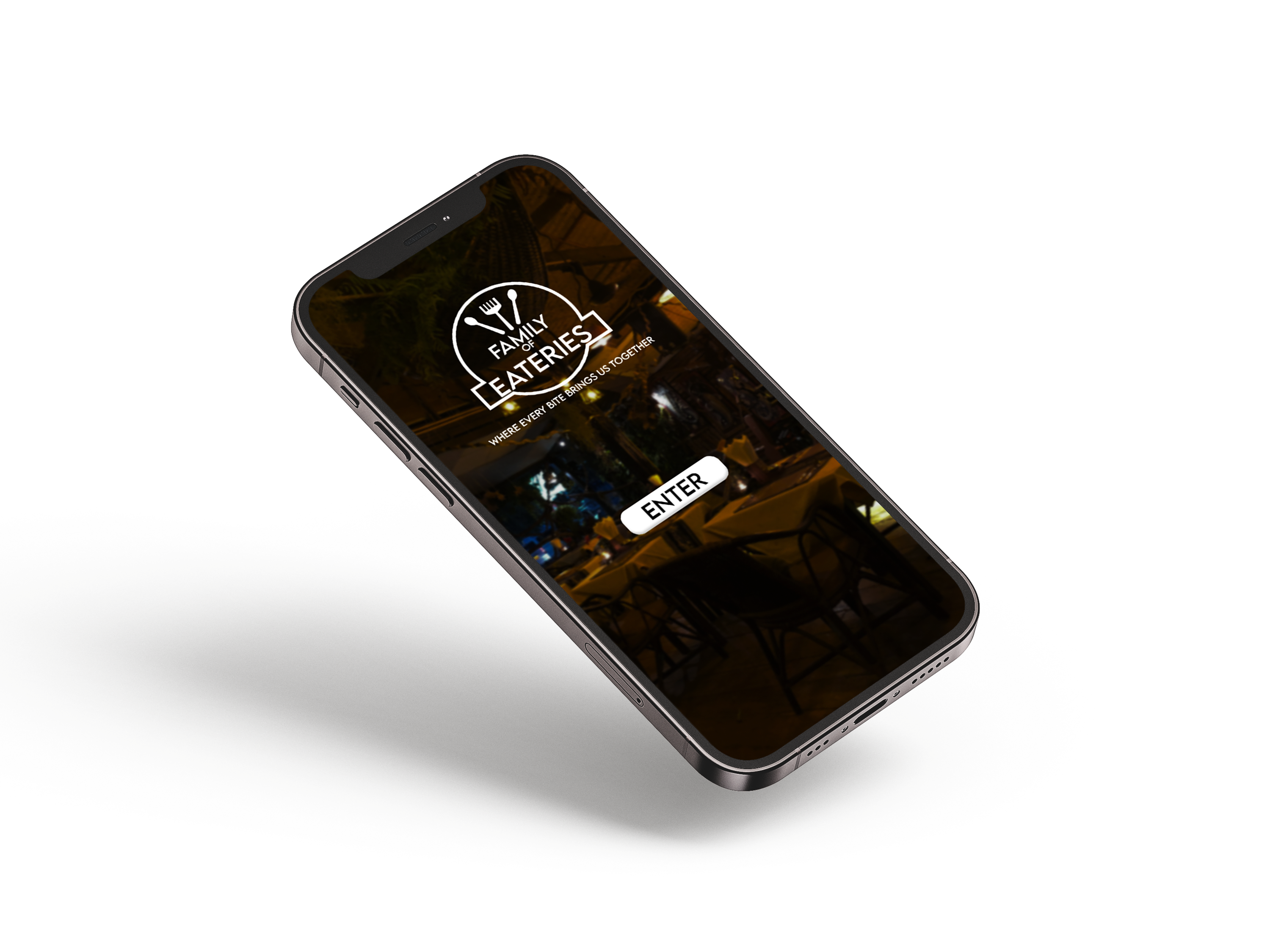
A master brand identity for a restaurant group, three individual restaurant identities beneath it, and the mobile ordering app all three live inside.
Crispy's, Hearth & Stone Bistro and 5 Vines each needed their own personality, one energetic, one warm and one refined, without the group reading as three unrelated businesses. The app had to carry all three without feeling like three different products.
How do you create three distinct restaurant brands that feel unique, while functioning cohesively under one unified parent identity?
Who it’s built for
The app serves three very different moments: Crispy’s is a quick, confident lunch order; Hearth & Stone is a relaxed weekend dinner with family; 5 Vines is a date night or celebration. That changed the design. Crispy’s had to be fast with fewer taps, 5 Vines had to feel calmer and more premium, and Hearth & Stone sat between the two. All three still had to live inside one familiar flow so the group never read as three separate products.
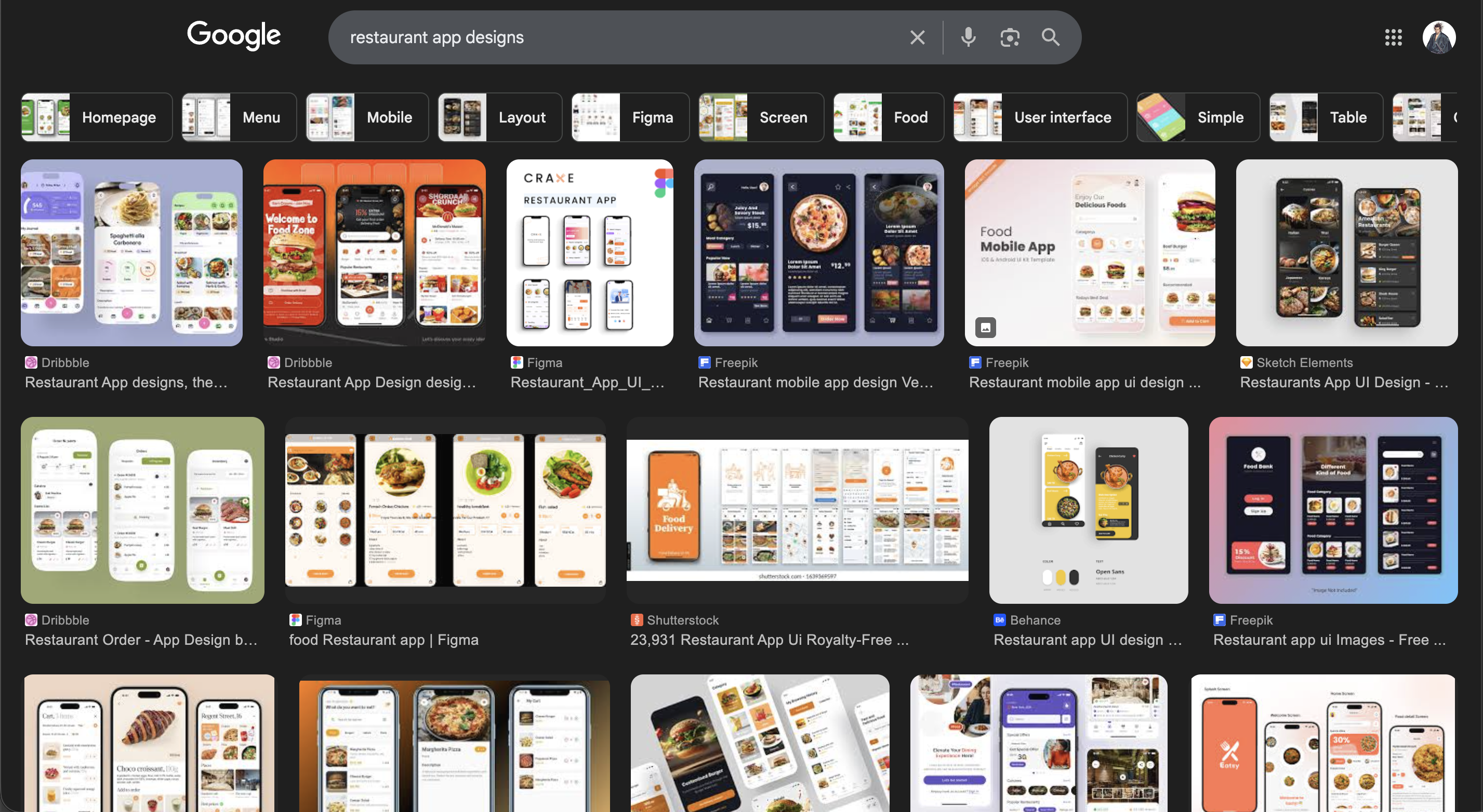
I started by collecting existing restaurant logos and mobile ordering apps to understand the visual patterns and branding strategies each category relies on: where restaurant marks get their personality and where app interfaces get their conventions.
Studying the app interfaces separately from the identities mattered: it told me which parts of the design had to stay predictable for users, and which parts were free to carry brand character.
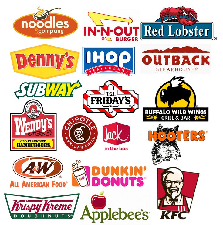
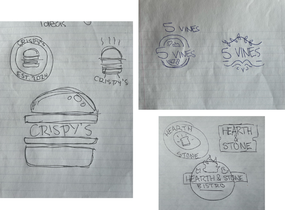
The parent mark stays neutral so it can sit beside all three restaurants without competing with them. Each individual identity then takes a clear position: Crispy's is loud and fast, Hearth & Stone is warm and hand-drawn, 5 Vines is quiet and classical.
What holds them together isn't a shared shape. It's a shared level of craft, consistent construction and a palette drawn from the same family.
A near-black anchor with three ingredient-driven accents, one per restaurant, so each brand can be recognised on its own screen while the group still reads as one palette.
Each accent is owned by one restaurant, so its screen is recognisable at a glance. Every value still comes from the same family, which is what keeps the group cohesive.
Each restaurant gets a display face that carries its personality and a supporting face chosen for readability at UI sizes. The pairing logic is the same across all three, which is what keeps the system coherent even though the voices differ.
Display: LEMON MILK
Supporting: Asimov Pro Bold
LEMON MILK carries the bold, high-impact headlines that match the brand's energetic personality. Asimov Pro Bold handles menu items and key UI elements with strong, clean typography.
Display: Bohemian Soul
Supporting: Source Sans Pro
Bohemian Soul brings expressive elegance; Source Sans Pro brings clarity. The pairing balances warmth and sophistication while staying readable across digital interfaces.
Display: Baskerville
Supporting: Noto Serif
Baskerville communicates refinement and tradition, while Noto Serif gives body copy a timeless, readable structure, and together they reinforce an elevated dining experience.
The interface had to absorb three visual identities without three different interaction models. I kept structure, spacing and component behaviour fixed across all three, and let colour and type do the switching.
The three components below are the ones every screen is built from, spec’d once and then reused unchanged across all three restaurant themes.
Shape: Fully rounded, 999px
Fill: #FF9D00 on #111111
Type: Archivo 700
High-contrast rounded buttons sized for thumb reach, using the brand orange so the next step is never ambiguous. Because the shape and label stay fixed, the accent colour is free to change with the restaurant theme.
Surface: #FFFFFF, 14px radius
Elevation: 0 6px 18px at 10%
Type: Restaurant supporting face
Elevated cards with soft shadows and rounded corners, adding warmth without losing clean separation between items. Item name, price and wait time hold the same positions in every card.
Shape: Pill, 1px rule
Active: Accent fill, reversed text
Type: Archivo 600
A simple tab row for switching menu sections, with the active state in the brand colour for immediate feedback. The row scrolls horizontally so the full menu never crowds a single line.
Before any of the visual design was applied, I mapped the screens and the path through them (browse, choose a restaurant, choose a category, build an order) so the layout decisions were made against a real flow rather than in isolation.
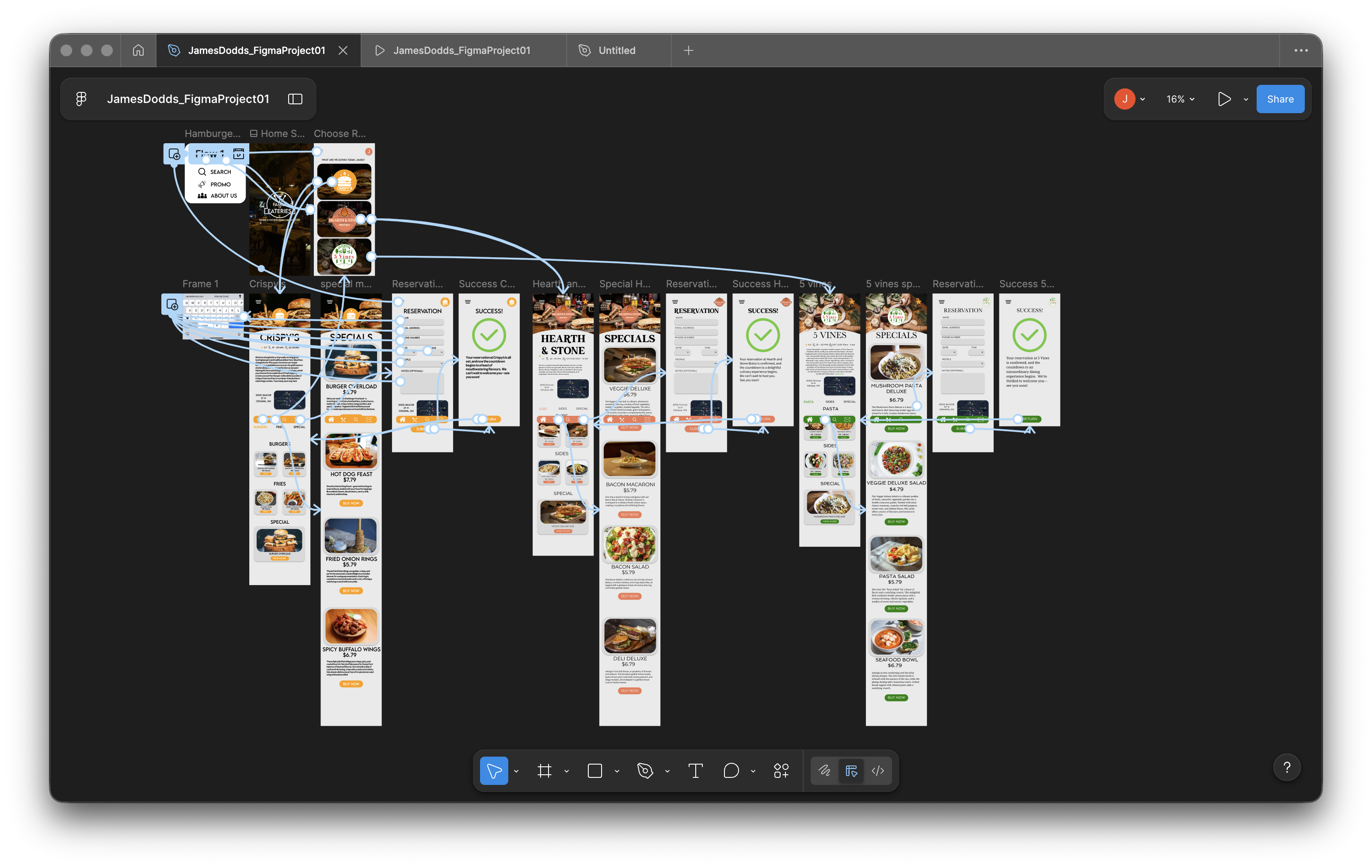
The work went through regular critiques with my instructor and classmates. Two notes genuinely moved the project forward.
The first was on the 5 Vines mark. The initial version was too ornate and lost its shape scaled down in the app’s tab bar. I redrew it flatter and cleaner in response, and the whole interface benefited once every mark survived at small sizes.
The second came up in every critique: the three app themes kept drifting apart. Instead of designing three bespoke layouts, I locked the structure, spacing, and component behaviour into one shared system and let colour and type do the switching.
Keeping three identities related was harder than making them distinct. Every bold decision for one brand had to be checked against the other two.
The fix was a shared set of rules: the same construction logic, the same palette family, the same interface system, with different voices on top. I’d build that shared language even earlier next time, before polishing any single brand.
The lesson that matters: a system is what makes three voices sound like one company.
I led the entire creative process from concept to final prototype.
That covered the master brand and all three restaurant identities, the colour and typographic systems, the wireframes and user flow, and the UI design and prototype build in Figma. Illustrator handled the identity work; Figma handled the interface and flow.
The parent mark plus three sub-identities: one system, three distinct voices.
The ordering flow, wireframes, and a shared UI system that carries all three restaurants.
One palette and pairing logic that keeps every brand recognisable on its own screen.
A working Figma prototype covering the full flow from browse to checkout.