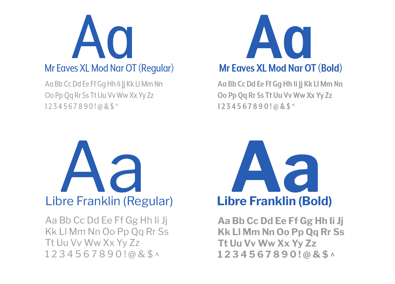
Display
Role: Cover, section openers, brand name
Heavy, open headlines carry the outdoor voice at a distance. Tracking stays tight so a long name like Riverway Outdoors still sits as one lockup.

A refined brand book for Riverway Outdoors: identity, visual language and an immersive outdoor ethos.

A comprehensive brand book for Riverway Outdoors, laying out the visual identity, tone and core values of an outdoor company as a system of type, colour, imagery and layout.
The book had to feel like the brand, not a spec sheet: connected to landscape and water, easy to navigate, and strict enough that someone else could apply the identity without guessing.
How can design bring Riverway Outdoors’ identity to life while making the visual system, values, and outdoor experience easy to navigate?
The audience is anyone who has to use the brand, from designers and marketers to partners, plus the people who meet Riverway in the world. The book needed to hold both: a clear system for production, and a feeling of being outside.
I started by collecting existing brand books and guideline sites to see how outdoor and lifestyle companies document type, colour and imagery, and where those documents get dry or hard to use.
That pass set the standard: what had to stay locked for consistency, and what could stay open so the book still felt like landscape rather than a template.
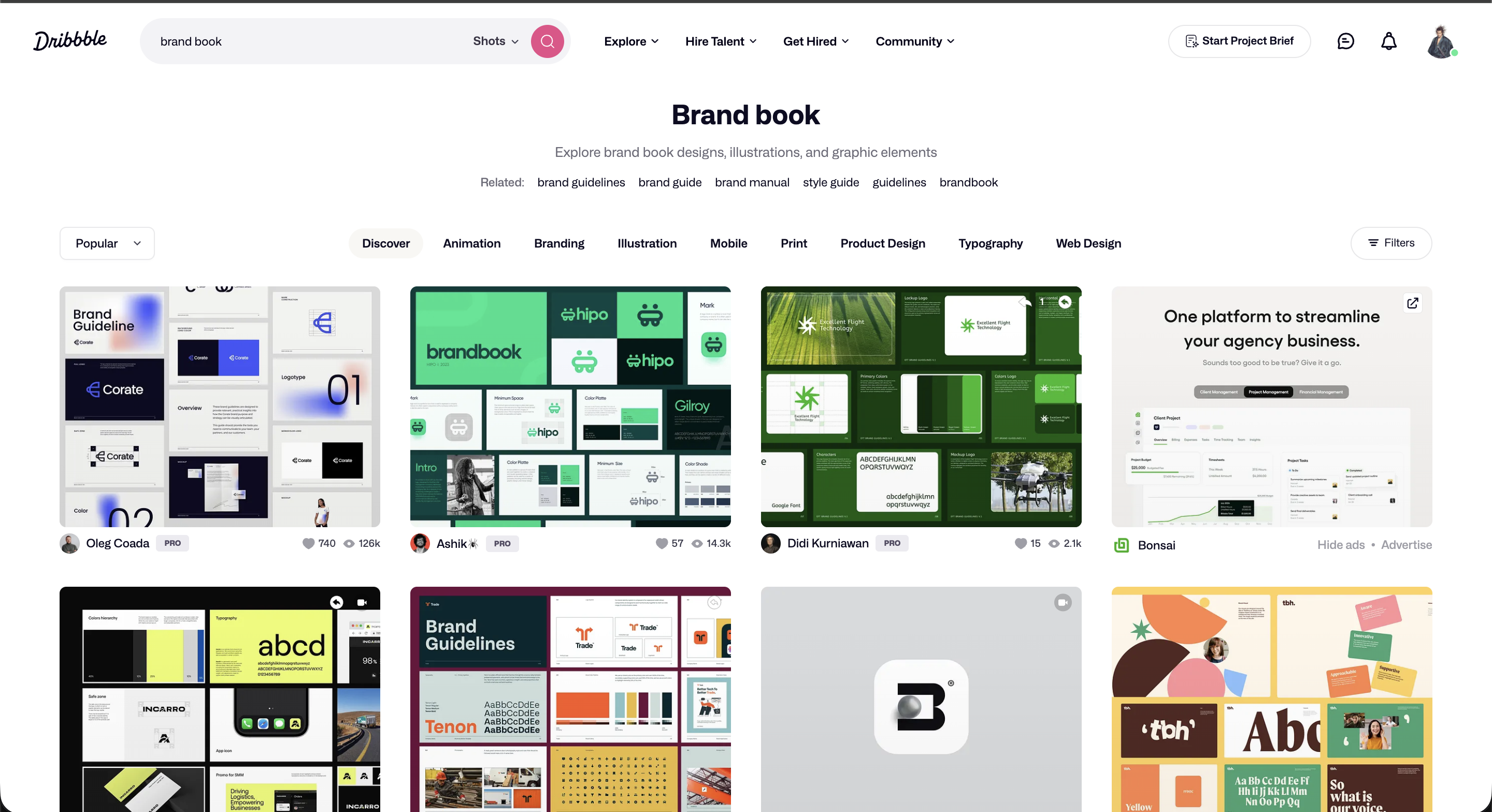
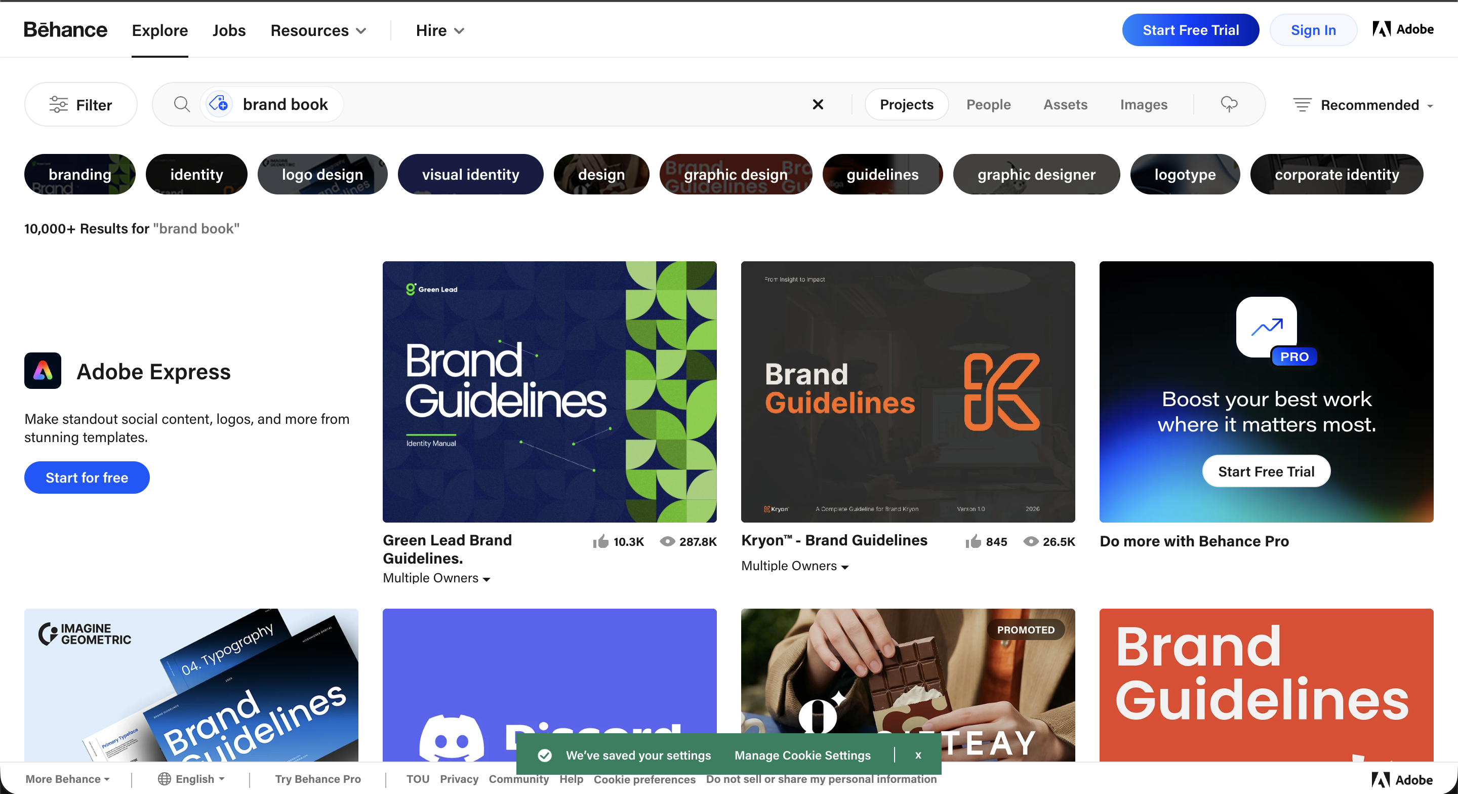
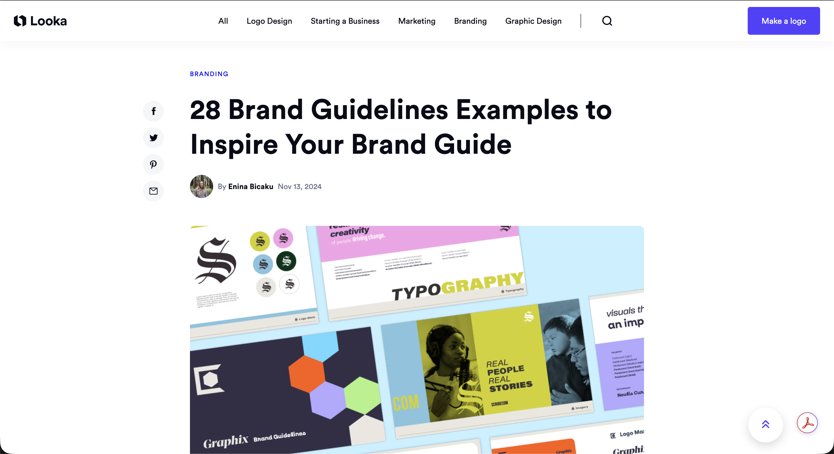
From that research I built layout systems, type hierarchies, and visual elements that could repeat across the book without going stale. Photoshop handled photographic treatment and page comps; Illustrator handled marks, grids, and the colour system.
What holds the book together is not a single motif. It’s consistent construction: grid, spacing and a palette that can sit on a cover, a spread or a product tag.


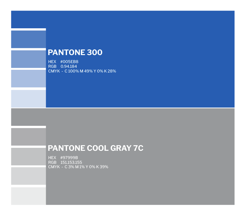
The palette is pulled from landscape: water, rock, and muted earth. Saturated enough to carry the Riverway mark, quiet enough to stay versatile across print, digital, and outdoor applications.
A clean, structured type system keeps the book readable and consistent. Hierarchy and spacing do the navigation, so a reader can move from voice and values into specs without the page shouting.
Role: Cover, section openers, brand name
Heavy, open headlines carry the outdoor voice at a distance. Tracking stays tight so a long name like Riverway Outdoors still sits as one lockup.
Role: Guidelines, captions, production notes
Supporting faces stay quiet and even, so rules and examples can sit on the same spread without competing with photography.
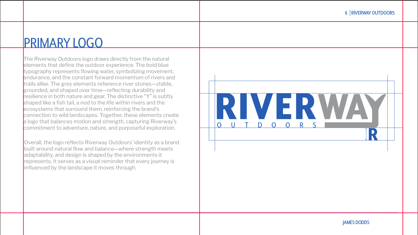
A flexible grid keeps every spread in the same family. Columns, spacing, and alignment create a cohesive reading experience while leaving air. The book should feel open, like the landscape it describes.
Before final art, I mapped the book as wireframes: cover, system pages and how a reader moves from story into specs, so layout decisions were made against a real sequence rather than isolated spreads.
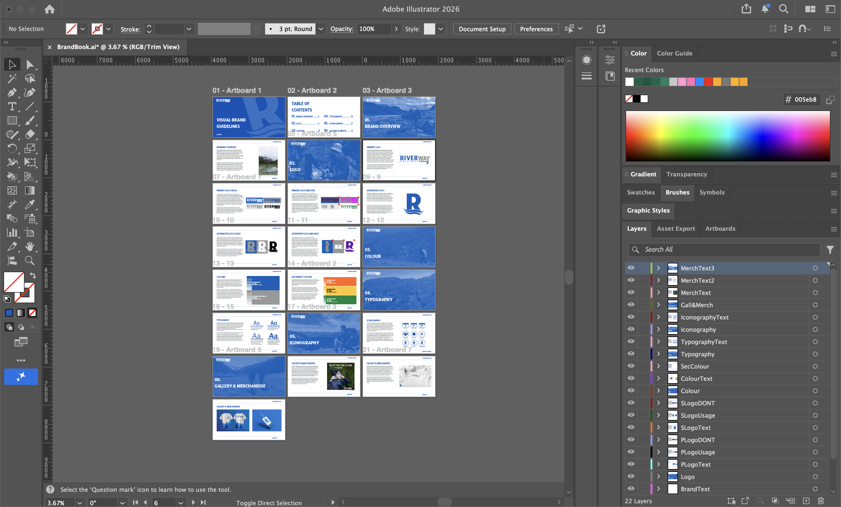
The finished document puts the whole system in one place: the Riverway mark, the outdoor voice, type and colour rules, and layouts that can travel from cover to application.
The early spreads were technically right and visually flat. The system was there, but the outdoor voice wasn’t. The critique that mattered most kept landing on the same point: a brand book has to make someone feel the brand, not just read its rules.
One revision came from trying to apply my own book. The specs kept getting lost among the photography, so I reworked the section openers and tightened the hierarchy until a reader could move from story into rules without the page shouting.
The final pass was about restraint, pulling back what didn’t need to move, so the brand, not the layout, was the loudest thing on the page.
A brand book has two users: the person who has to apply it and the customer who only ever feels the brand. Every page has to serve both, and the tension between those two jobs is the real craft.
The grid and type system did more work than any single spread. Once the construction was consistent, new pages almost laid themselves out, which is exactly the outcome the book is meant to create for the people who use it.
Next time I’d build the wireframe sequence earlier and design against the whole book flow before any single spread was finished.
I led the full design process, from concept through production of the finished book.
That covered visual direction, layout, typography, colour, and the cohesive system those pieces sit inside. The work was turning an outdoor brand into a document someone can actually use.
Mark, imagery treatment, and the outdoor voice carried across the whole book.
A flexible grid and hierarchy that guide the reader from story into specifications.
The type system and landscape palette locked in for repeatable use across every application.
The finished book, constructed and delivered in Illustrator and Photoshop.